beacon mental health app
UX Designer, 2023
about the product
Beacon makes it faster & easier for patients to find and schedule appointments with mental health care providers who fit their individual treatment needs.
how can the process of finding a mental health provider be improved?
Millions of individuals in the United States live with a mental health disorder. Finding suitable mental health care can be a stressful & time consuming process. Through primary & secondary research, I discovered that the process of finding & scheduling an appointment with a mental health provider needs to be streamlined & simplified. The user pain points my research revealed can be addressed by an app designed to guide a user through the process of finding a mental health provider, step by step.
my responsibilities
Research
UI Design
Wire Frames
Prototyping
Usability Testing
research/synthesis
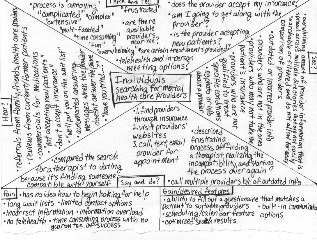
According to the National Institute of Mental Health, millions of people in the United States experience mental illness. People of every age, race, & social demographic are affected. I conducted interviews with 5 individuals who experience mental illness. The majority of individuals interviewed have had negative experiences in finding mental health care due to several factors:
Uncertainty in how to find a provider
Out of date or missing provider information
Overwhelming amounts of information spread across multiple directories.
Scheduling frustrations
A majority of users I interviewed reported that finding their first therapist was the most difficult step in the process because until a persona has a diagnosis they may have no idea what to look for in a provider. In addition to the difficulty of navigating large amounts of information scattered across different sources, users also reported frustrations with scheduling appointments & communication difficulties between patient & provider. I used these pain points to decide what features to include in the minimum viable product.
competitor analysis
ideation
Using Nielsen heuristics, I analyzed 3 existing products & services that help individuals find mental health providers: Psychology Today, Alma, & Monarch. I used my analysis as a guide during ideation, helping me design screens that would be familiar to users & based on established guidelines, but also visually unique and functionally improved.
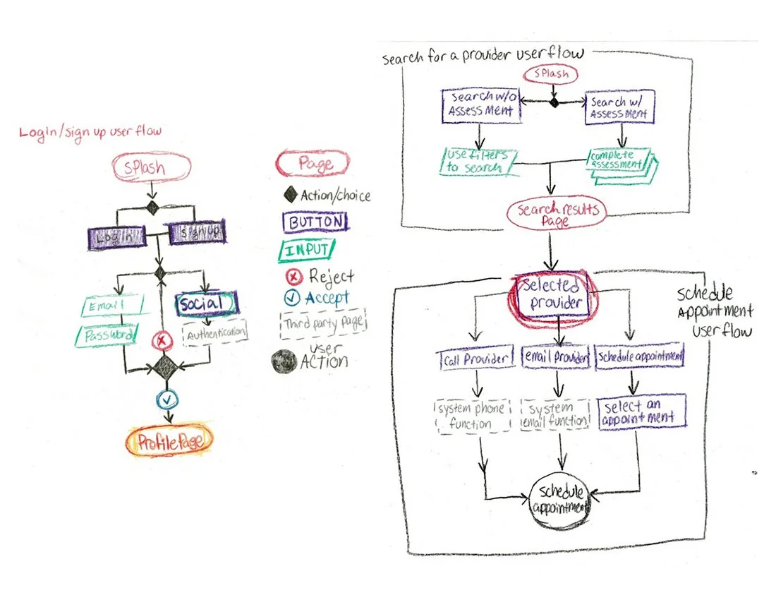
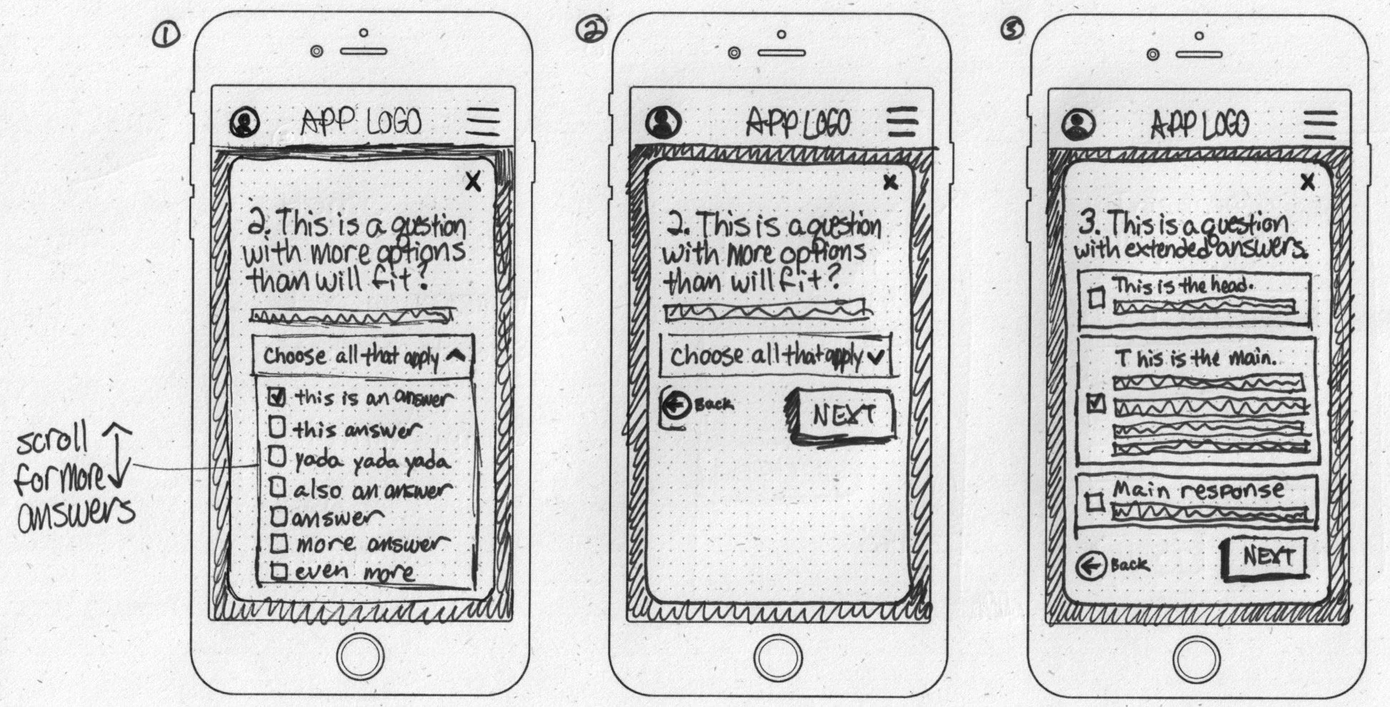
Based on pain points reported during user interviews, I focused on sketching screens for 3 primary user flows: sign in/sign up, searching for a provider, & scheduling an appointment.
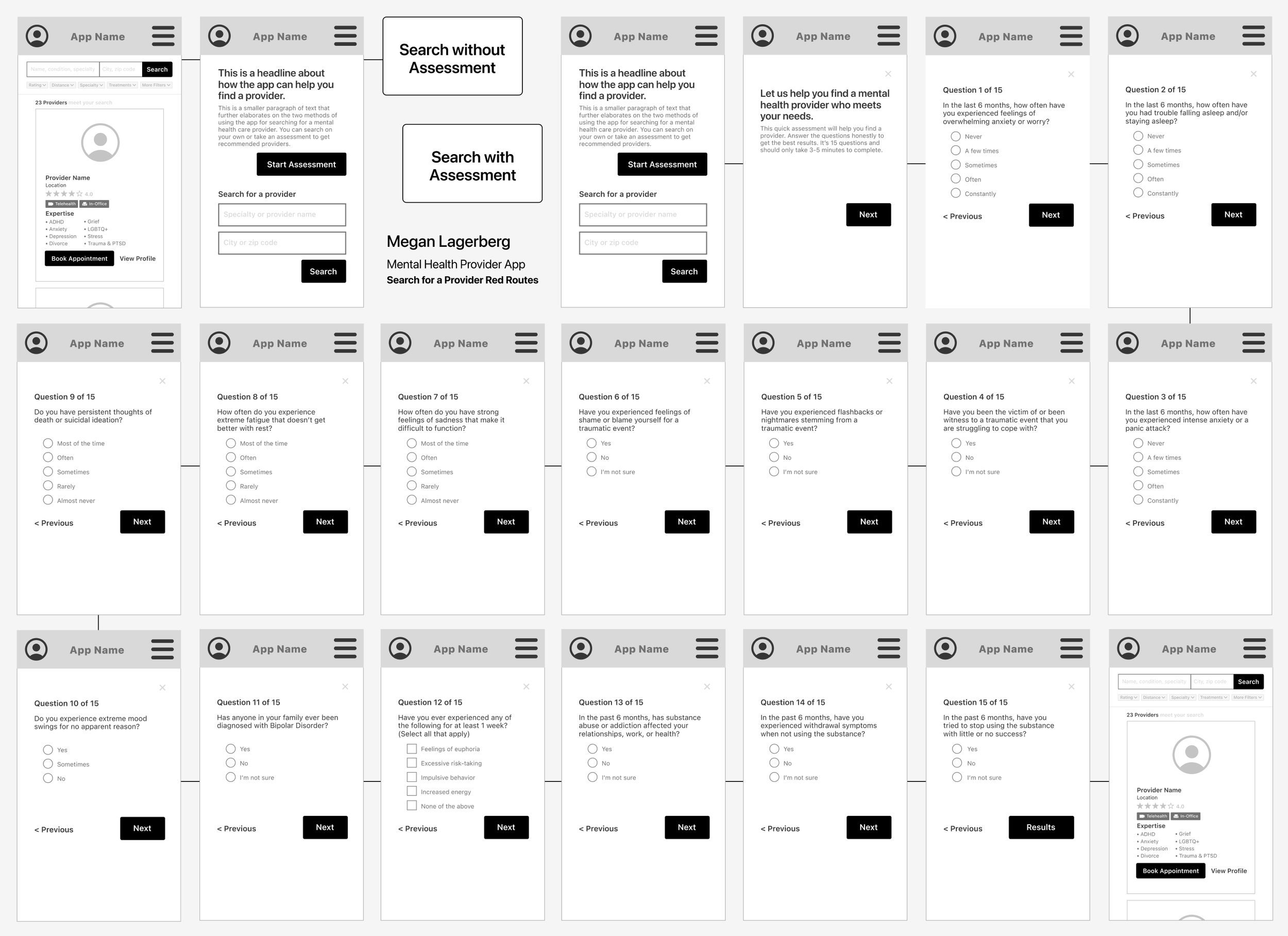
Several users I interviewed reported that choosing their first therapist was difficult because without an official diagnosis they didn’t have the information necessary to know what to look for in a provider. To address this pain point, I designed an additional user flow for searching for a provider with a basic mental health assessment. The user’s responses to the assessment filters the search results to show providers that treat conditions that include those symptoms.
After sketching the primary screens for each user flow, I created wireframes for the prototype. The largest user flow I created for the MVP was the search with assessment option. To create the assessment used in the prototype, I researched general mental health assessments. I primarily used information I found on Psychology Today, which has many different self-assessments that users can take. I used these as a guide for creating an assessment for my prototype, making note of what questions were asked and how many were included in each assessment.
I gathered feedback about the low-fidelity prototype from 5 random members of the public using guerrilla testing. I asked the participants to perform two tasks in the prototype: sign in/sign up & search for a provider. When those tasks were completed I asked the participants to explore the app & give feedback on its functionality. Participants described it as “self-explanatory” & “familiar”.
UI design
My research into existing products for finding mental health professionals provided insight into the visual personalities of these products. I began thinking about what features make this product unique & different. Since many of the individuals I talked to about their experience mentioned feeling lost & in need of guidance, I wanted the visual brand of the product to reflect the idea of being guided on a journey to improved mental health.
Lighthouses are strong visual representations of guidance & hope. Another name for a visual guide is a beacon. Keeping with the nautical theme, I chose a color palette of calming ocean blues paired with a sandy tan & a dark red. I chose a friendly, approachable sans serif typeface, Korolev, for the beacon logo & app typography. The illustrations I used are from storyset.com & I customized their colors in Illustrator to match the brand.
High-fidelity prototype moderated usability testing
I tested the high-fidelity prototype with 5 individuals who had prior experience searching for mental health providers. This revealed a number of major & minor issues with the app’s usability.
4 out of 5 participants had difficulty figuring out how to reschedule an appointment.
Solution: Remove the option to start the user flow without signing in or creating an account & add more information to the confirmation screens between steps that direct the user to the user profile.
3 out of 5 participants had difficulty figuring out how to message the provider.
Solution: Relocate the message provider button to the provider profile card on the search results page.
One participant noted that in the edge case rescheduling flow, the screen for adding the patient’s information is unnecessary since the provider should already have that information.
Solution: Remove the screen from the user flow.
conclusion
After updating the high-fidelity prototype, I conducted more moderated usability testing with a new group of participants. Every participant was able to successfully find the rescheduling feature without help, as well as find the messaging feature & successfully message a provider.
Working on this product, particularly when conducting usability testing, provided me with personal insights that I will apply to future projects. I learned to resist the temptation to give the participant unsolicited hints during usability tests. It was very difficult for me at first to allow the person time to hesitate & think about their next action. Giving a participant time to ask for help allowed me to observe & document pain points in the user flow.
I also learned to relax. I was very nervous the first time I conducted a usability test. Even as I reassured participants that it was the prototype and not themselves being tested, I likewise couldn’t help but feel like I was the one being evaluated & not my design. Maintaining a growth mindset helped me remain open to feedback.

