funfinder app
UX Designer, 2024
about the product
FunFinder is an app designed to help caregivers find local events and activities for children.
how might we improve the process of finding local events & activities for children?
What if caregivers of children could find local activities & events for kids without time-consuming web searches or signing up for dozens of newsletter emails? What if there was a product that collected all of the kid-friendly events & activities in a user’s area into one easy to use & searchable resource? And what if users could access that source from their phone wherever they go?
my responsibilities
Research
Ideation
UI Design
Wire Frames
Prototyping
Usability Testing
research/synthesis
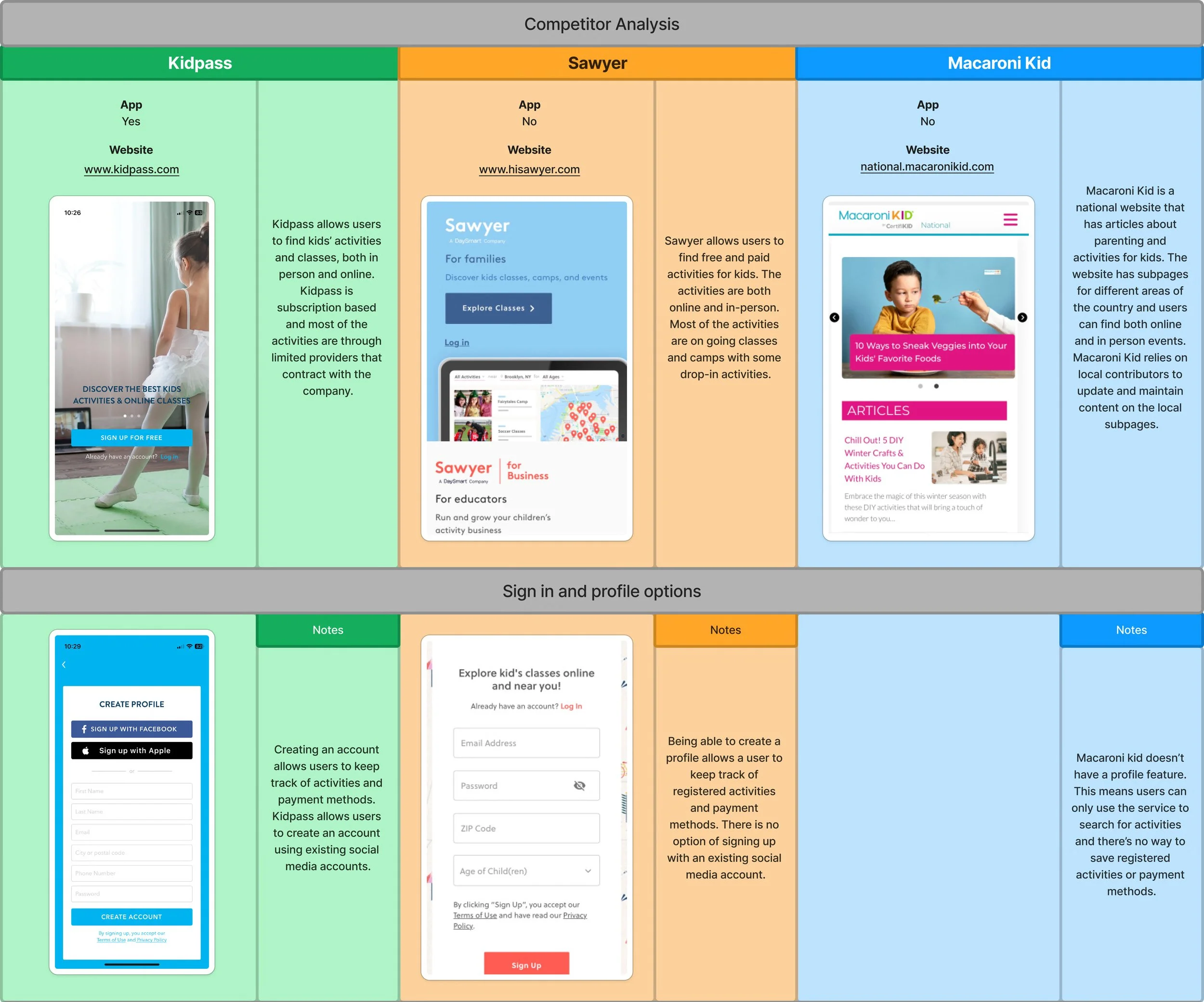
Are there existing products or services that address this problem? A competitor analysis uncovered multiple pre-existing apps & websites dedicated to helping caregivers find activities for kids. I analyzed the features & functionality of the three top competitors.
Two competitors, Kidpass (app) & Sawyer (website), have the option to create an account & profile. Both are primarily focused on helping parents find classes & camps, rather than single events. Macaroni Kid has information about camps, single events, & classes. However, Macaroni Kid does not have an option to make an account & parents must sign up for activities through third party websites.
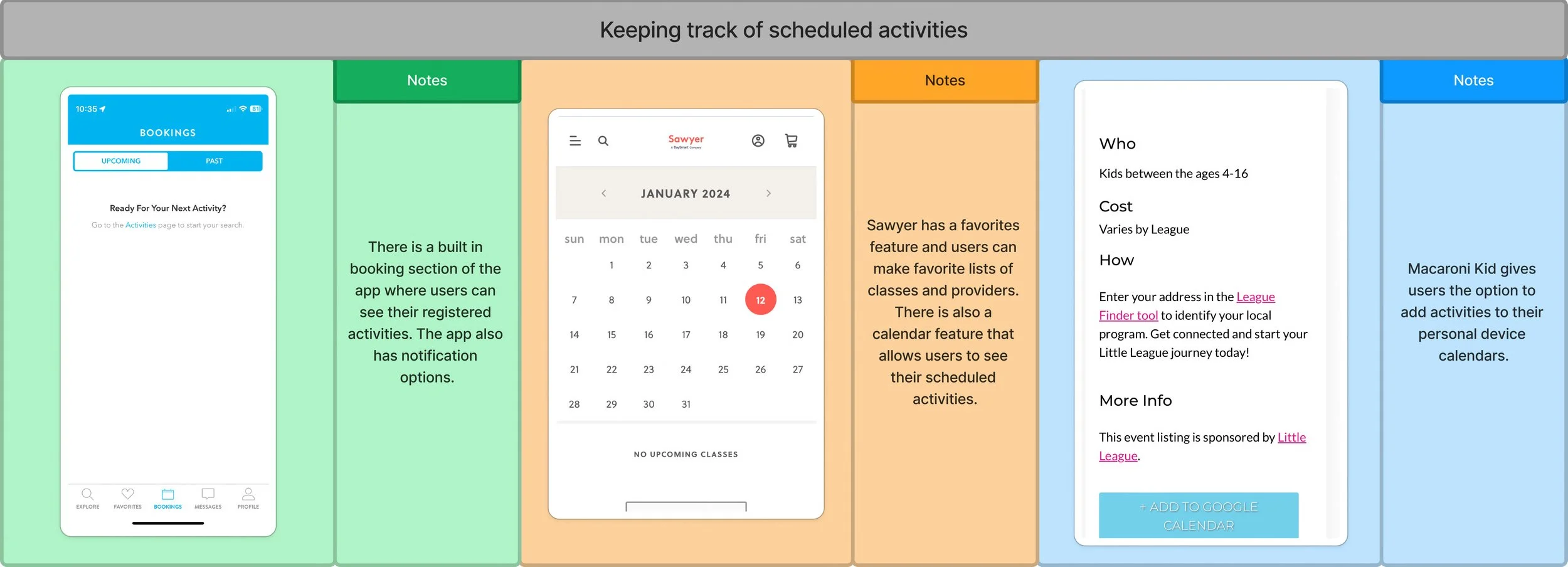
All 3 competitors offer notification options for discovering new activities. Sawyer & Macaroni Kid have blog features that highlight events & offer ideas for at home activities. Kidpass & Sawyer both have a calendar feature to help users keep track of scheduled activities. Macaroni Kid allows users to add events to third-party calendars only.
To determine what features to include in the minimum viable product, I designed a survey through Google Forms & used social media to recruit parents & caregivers of children under 18 to respond. My goal was to discover how respondents search for activities, how they keep track of scheduled activities, & the types of activities they are searching for.
80% reported finding activities through online research
90% reported learning about activities from friends & family
80% reported using a calendar app to keep track of activities
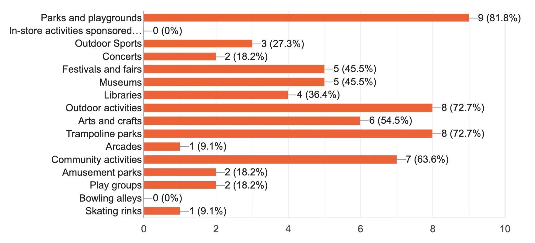
Respondents reported searching for many different types of activities for a broad range of age groups
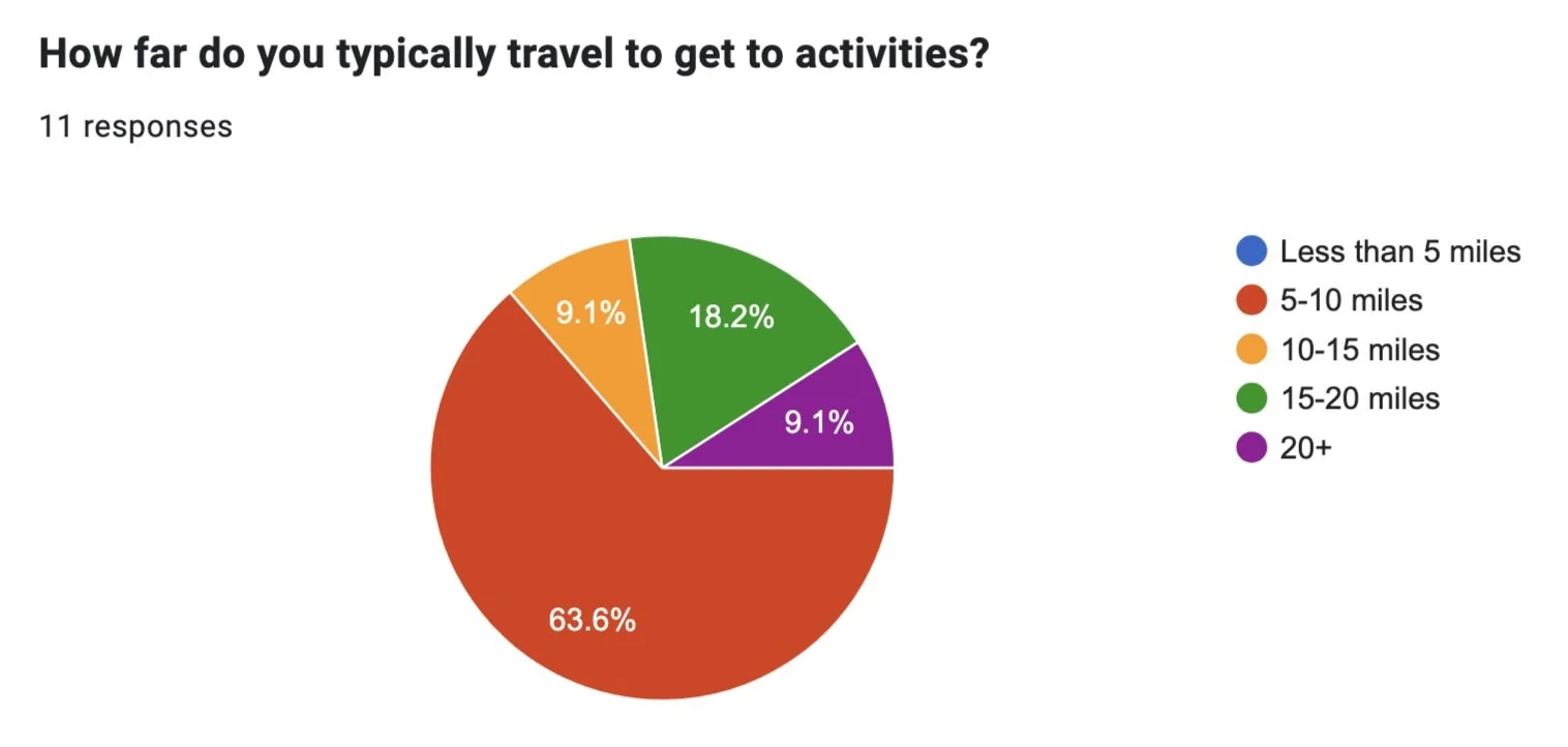
Cost of activity & the distance respondents were willing to travel to an activity also varied
To synthesize my research findings, I created a Jobs To Be Done framework that outlined the features to be included in the MVP.
Who:
Parents searching for local activities for kids
What:
Search for activities
Register for activities
Keep track of scheduled activities
Pay for activities
Learn about new activities
Save favorite activities, providers, locations, etc.
Needs:
A way to search for activities
Filters for age, cost, distance, and category
Reminders of scheduled activities
Activity recommendations
A profile for saving contact & payment information
Where/when:
When a new regularly held class or activity is needed
When a single time activity is needed
I conducted a series of short interviews with members of the target user demographic. A majority reported that they most often look for activities to do on the same day & had no issues with paying for the activity in person or through the event’s website. For this reason, I decided to focus my efforts on building the search & calendar functions of the product.
ideation
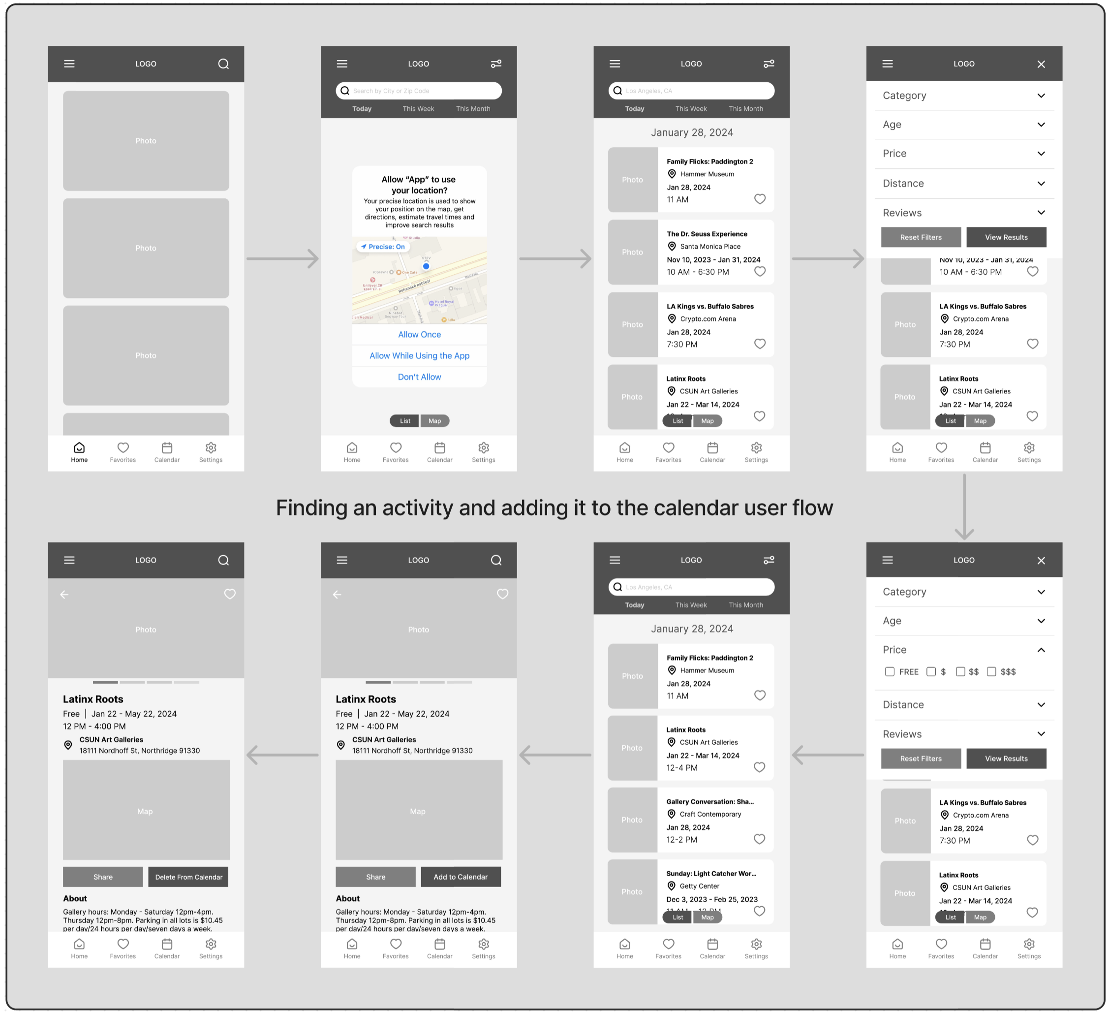
To quickly explore as many ideas for screen layouts as possible, I did an exercise called Crazy 8s. Using this method, I was able to generate 8 unique screen layouts in 8 minutes. I did this for key screens in each of my user flows. I chose what I believed to be the best screen layout ideas and created wire frames for my low-fidelity prototype in Figma.
low-fidelity prototype moderated usability testing
I conducted moderated usability testing for my low-fidelity prototype with 5 participants.
Several participants were confused by the content of the home page of the app & didn’t immediately notice the search icon. This was a problem since searching for an activity is one of the app’s primary features.
Two participants noted that the heart icon needed to be relocated or redesigned to be more visible.
Each participant was able to find & use the add an event to calendar & share functions without any assistance.
Users had mostly positive feedback about the functionality of the filter function, but at least one participant was confused by the filter icon design.
Another user noted that including the price on the event cards on the search results screen would help indicate when the results were being filtered by price.
I used the feedback I gathered from the usability tests to improve upon my UI design and user flows in my high-fidelity prototype.
visual design
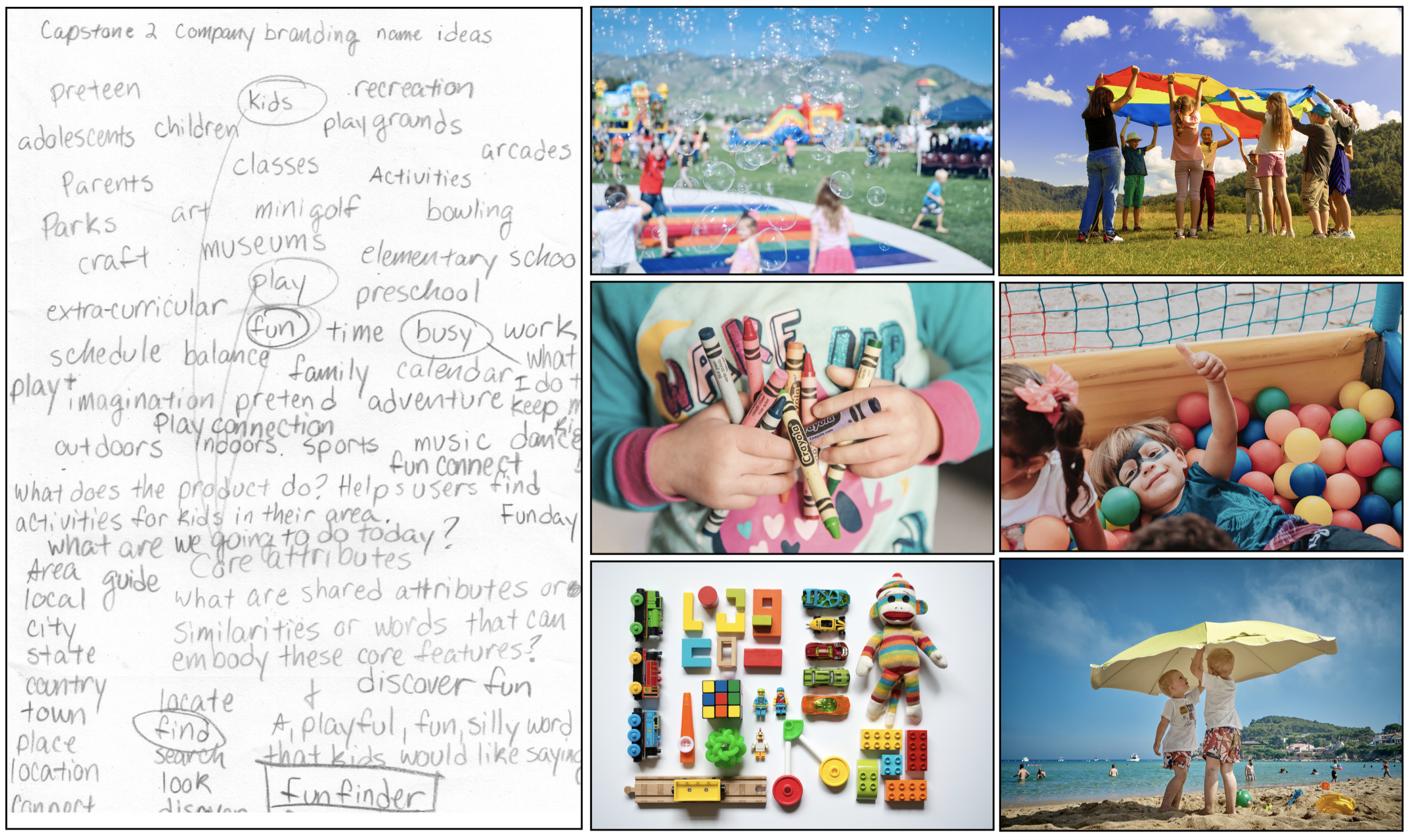
To guide the visual design of the app, I created a mood board and brainstormed ideas for a product name. I chose bright, saturated colors to give the app a sense of fun & energy. I used the sans serif font Variex for the logo because its irregular letterforms have a childlike quality. I paired it with the rounded sans serif font Omnes, which is friendly & easy to read. To create a splash screen for the app, I sourced icons from flaticon.com
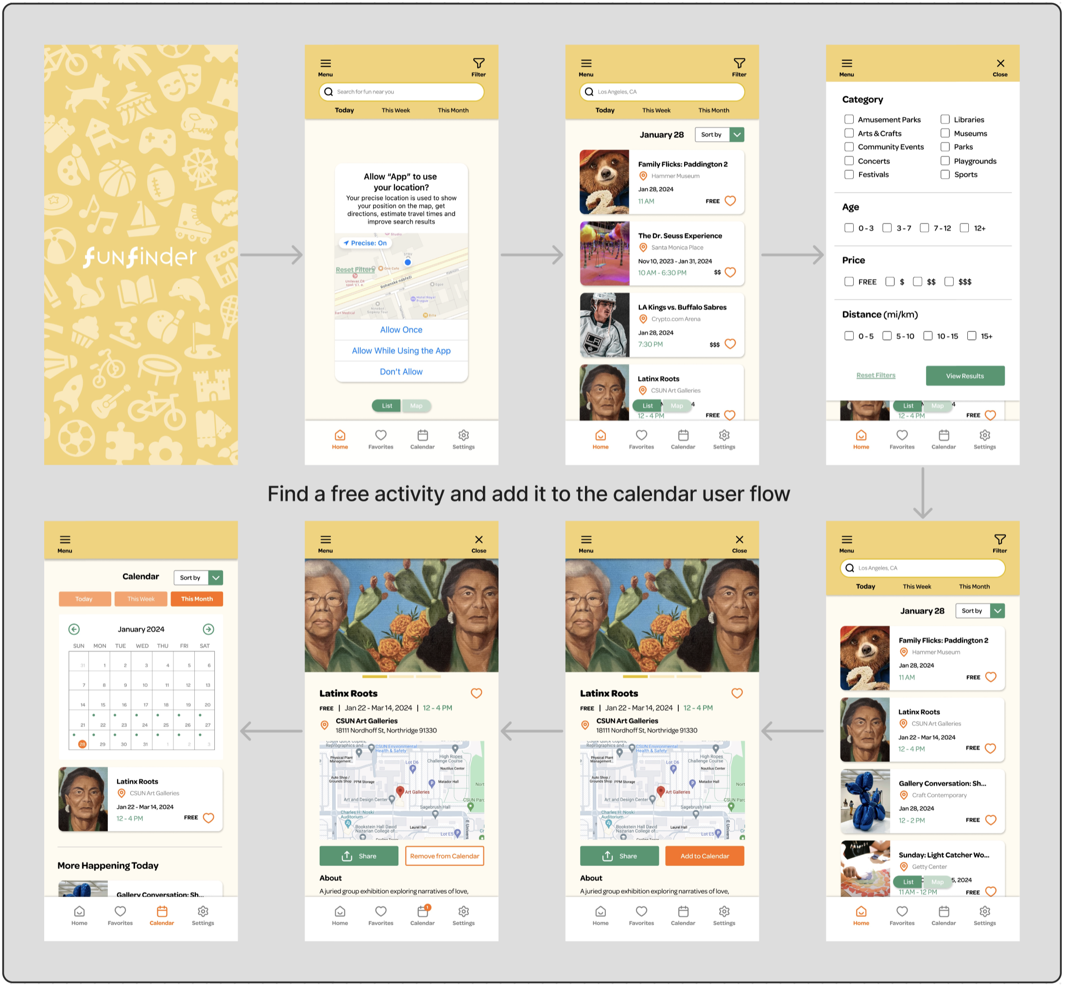
high-fidelity prototype moderated usability testing
I had a short time frame (just over a month) to complete this project. Caregivers to children are very busy & often have their schedules planned weeks in advance. Since I needed feedback quickly, I chose to do a combination of moderated usability tests & guerrilla testing for my high-fidelity prototype. I took my prototype to the local elementary school & asked random parents & staff members to test it.
I asked each participant to complete 3 tasks:
Find a free event & share it with a friend.
Add an event to the calendar.
Save an activity for later.
User feedback was mostly positive, with 4 out of 5 participants completing all the tasks quickly without assistance. Participant suggestions for improvement included:
Add a filter option to the favorites section
Redesign the share button to include the commonly used share icon
Allow the in-app calendar to sync with existing third party calendars on the user’s device
conclusion
This project had a tight deadline & challenged me to improve my time management skills. Using the ideation technique Crazy 8s allowed me to come up with multiple possible solutions to a problem in a short amount of time. The time constraint also forced me to get creative in how and where I conducted usability testing. I learned that to quickly gather maximum user feedback, it’s necessary to take the prototype directly to the user demographic.


