sommchat ai wine app
UX Designer, 2024
about the product
Sommchat is an AI powered wine recommendation app that helps users find new wines to try based on their personal taste preferences.
project synopsis
I worked on this project with two other UX Designers. We collaborated with the client who provided us with user personas, user flows, & competitive analysis. My team was tasked with creating a high-fidelity prototype of the product & conducting usability testing.
team responsibilities
Color Palette
UI Design
Icon Design
Prototyping
Usability Testing
ui design
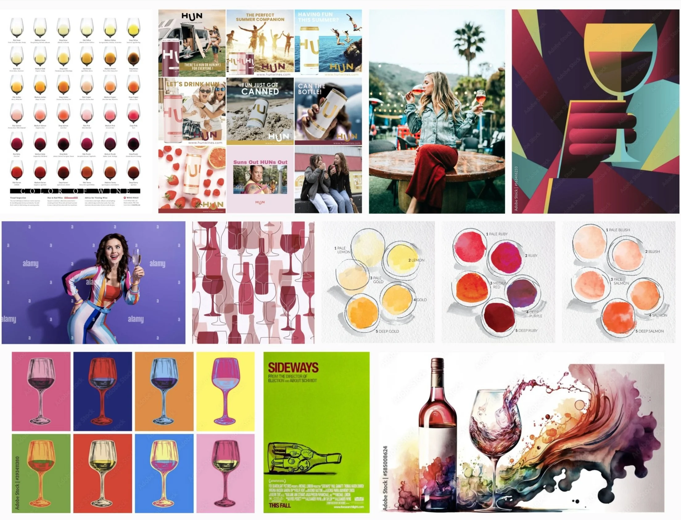
The client provided the following synopsis of the personality of the product. My team & I used this synopsis to create mood boards to develop the UI Design of the product.
Voice:
Informative & knowledgeable in a fun, light, engaging, approachable & unpretentious way.
Overall Aesthetic:
Minimal maximalism: pulling minimal design components using clean lines, white space, & uncluttered layouts to avoid overwhelming users with a flair of fun modern maximalist colors & features.
Intuitive: design is easy to understand & navigate, even for first-time users.
Content focused: design prioritizes visual content, making it the central focus.
Polished, but approachable: has a high-quality look while leaving room for being fun & approachable
Goal:
Ingest personality, life, community, & human touch into a digital and AI driven product
Core Values:
Accessibility, engaging education, community, innovation, & delight
The team presented our mood boards to the client who gave us feedback on what they liked from the visual ideas we gathered. At this point, the team decided to divide tasks into three parts. My team members worked on refining & making wire frames for the onboarding & chatbot user flows & I worked on creating a color palette, finding fonts for the app/logo, & creating icons.
color palette
typefaces
I went through several rounds of refining the color palette with the client. This is the final palette the client approved. We used the client approved colors for the high-fidelity prototype. After testing the color palette against WCAG accessibility standards, I discovered that the chose color palette did not pass. I advised the client that the colors would need to be adjusted before product launch. I created a new color palette with passing colors that I presented to the client.
I presented to the client two font options for the logotype based on the product’s personality description of being fun & modern. The client approved the typeface Bely Display Regular.
The client suggested Montserrat for the app’s typeface & the team approved it for its legibility & numerous font options. As a team, we decided on the following typeface combinations for the app.
icons
The client gave us a list of over 50 tasting notes icons to create for the app. Due to time constraints with the project, I advised the client that I would have time to create 5-7 original icons for use in the prototype. The rest of the icons used in the app were stock icons the team found online.
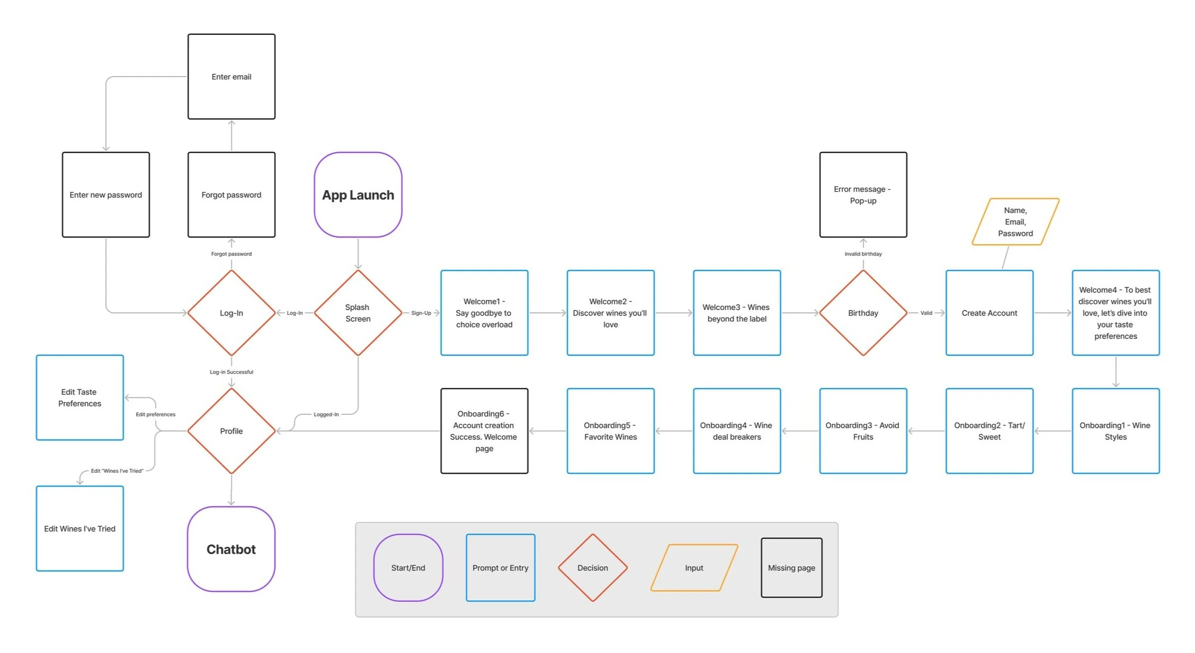
My teammates worked on applying the style guide we created to the high-fidelity user flow screens, as well as refining the client’s provided layouts. One of my teammates also created user flow charts to reference while organizing the screens for the prototype.
user flows
High-fidelity prototype
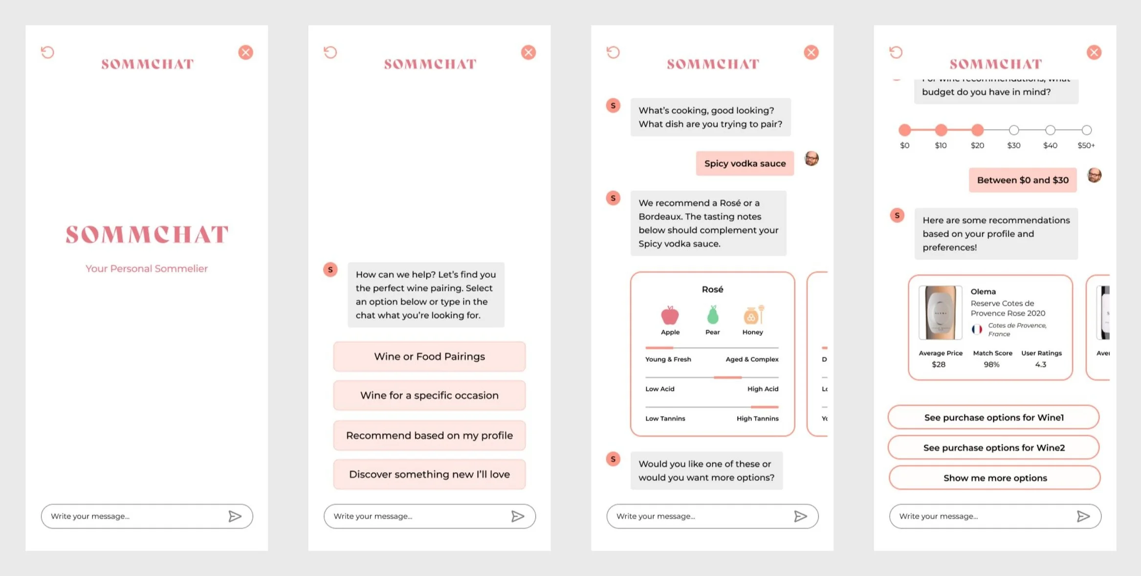
The team collaboratively worked on finding illustrations, icons, & images to use in the high-fidelity prototype. We also collaborated on designing elements for the user profile screens. I made the buttons for the taste preferences & the buttons used throughout the app. My teammates worked on the layout, heart icons, & sort by filter feature. My teammate created the lemon slider in the onboarding flow & I created the price slider in the chatbot flow.
The team collaboratively worked on designing the cards used within the chatbot using the flavor profile icons I created. My teammate created the chatbot flow of the prototype we conducted usability testing on.
usability testing
Once the client approved the high fidelity prototype, the team conducted moderated usability tests with participants who had varying degrees of wine knowledge. We collaborated to create a script for testing the onboarding & chatbot user flows. We also tested two edge cases where we asked the users to edit their flavor preferences & interact with the “Wines I’ve Tried” section in the user profile. We tested the app with 4 participants & recorded the sessions for our notes.
Test Results:
Most users found the onboarding process easy to follow, but some would have preferred a next & back button instead of the chevron arrows.
Users appreciated the simplicity of the profile page & at least one suggested adding filtering options & a browsing/shopping function to the profile.
Users found the chatbot function interesting, but most were surprised to encounter it & indicated that they were not expecting that when tapping the “Get Recommendations” button.
In general, users appreciated the range of options for indicating taste preferences & wanted more choices, especially regarding flavors.
There was a consensus that the “Get Recommendations” button should lead to a new questionnaire for personalized suggestions, rather than the chatbot feature.
Other suggestions improvements included integrating local wine availability into the purchase options feature, redesigning the button that leads to the chatbot feature, & providing more comprehensive details for users to make more informed purchasing decisions.
conclusion
I enjoyed working on this project with my team. The client was very good about scheduling frequent & regular meetings with our team as well as providing useful feedback on our work throughout the process. There were times when the client wanted to focus more attention on perfecting elements of the UI design, especially the color palette & we had to guide them to an understanding that we needed to move forward with the UX process due to time constraints. This project gave me experience collaborating with a team through regular meetings & keeping an open line of communication through emails. It also helped me practice my organization skills by using the shared Google drive to keep track of documents.


